NASA Temperature Anomalies from 1880 to 2012
It’s easy to get confused by this deluge of information and statistics – which is why this new animation from NASA is so useful.
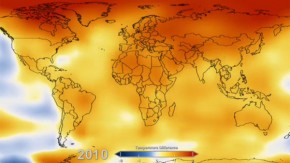
In their own words it “displays a progression of changing global surface temperatures anomalies from 1880 through 2012. Higher then normal temperatures are shown in red and lower then normal temperatures are shown in blue.”
For more details on their methodology visit the NASA website.